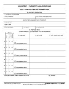
At first glance, the Standard Form 330 (SF330) used by architects and engineers to submit their qualifications for a new Federal contract (and sometimes state and local agencies request it too), is terribly boring and limited. For designers, using a standard form to showcase their experience and projects is a contradiction. Design firms, by their very nature, are used to laying out their qualifications packages to match their firm’s unique brand and style. The layout of their proposal package can be a differentiator. But to win Federal contracts, the SF330 must be used.
Looking at the SF330, it seems like a big constraint to creativity – checking boxes, filling in the form. It looks like it could be done by simply pressing a button and exporting data from your CRM.
But the constraints make it more creative. Within the parameters of a government form, we get to tell the story of why we are the most highly qualified for the project.
Using the synopsis / solicitation as the guide to what content must be included and what the customer wants to learn about your experience and expertise, coupled with the requirements of the form, the creativity comes through in the writing – using each word wisely within the space allowed. It comes from the design – adding images, graphics, color and bold fonts to draw the reader to key points.
Below are some of the basic branding elements that can be added to your SF330 form to make it stand out and demonstrate your qualifications in the best presentation.
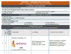
- Update the section divider cells within the form with your brand colors in the headers and where it makes sense to break up the form on Sections A-C, E, F, and G
- Add branding to the headers and footers, outside of the form, to include your logo and other content that your firm uses on proposals (solicitation number, client name, etc.) using your brand fonts and colors
- Use firm logos in Section C to call attention to brand recognition of members of your team
- Insert photos and graphics into Section F to showcase your projects
- For key points throughout the document use icons to call attention to important items of relevancy or differentiators you bring
 Be consistent with formatting the fonts, i.e., if Section E resume names and roles are bold, use bold for the title of the projects in Section F
- Approach Section H like any other proposal layout and use the whole space to incorporate the additional information, depending on the solicitation requirements – one or two column, distinctive headlines and sub-headings to separate information, summarize key points with infographics, insert photos where it makes sense to continue demonstrating your qualifications, above all – make it easy to read and find the required information outlined in the synopsis.
What other ways do you make the SF330 form work for you?
